

Where Did The BMW Logo Came From? - Okey DoKey Locksmith
 The BMW logo is one of the most recognizable automotive emblems in the world. Its circular design, black outer ring, BMW lettering, and alternating blue-and-white sections have represented the German manufacturer for more than a century.
But what does the BMW logo actually mean? One of the most persistent stories says that the blue and white sections represent a spinning airplane propeller against a blue sky. The real history is more complicated. The logo's origins are closely connected to Bavaria, while the famous propeller interpretation developed later.
Today, the propeller story remains strongly associated with BMW, even though the company's own historical account explains that the original emblem was not designed as a propeller.
Contents
What Does the BMW Logo Mean?
The BMW emblem consists of a circular black outer ring containing the letters BMW, with the center divided into four alternating blue-and-white sections.
BMW stands for Bayerische Motoren Werke, commonly translated as Bavarian Motor Works. The blue and white in the center of the emblem are closely associated with Bavaria, the German state where BMW originated.
The design is also connected to the emblem of BMW's predecessor, Rapp Motorenwerke, which used a circular black border surrounding its central symbol. When BMW developed its own trademark, it retained the general circular form while replacing the center with the blue-and-white pattern.
Origin of the BMW Logo
BMW's history began with aircraft-engine manufacturing rather than automobiles. The BMW name emerged in 1917 when Rapp Motorenwerke became Bayerische Motoren Werke.
The first BMW trademark was registered that same year. Its design already contained the basic elements that remain recognizable today: the circular shape, the letters BMW around the outside, and four blue-and-white sections in the center.
This aviation history later played an important role in creating one of the most enduring misconceptions about the emblem.
BMW eventually became famous for motorcycles and automobiles, and today the emblem appears on everything from vehicle hoods and steering wheels to BMW keys and remotes.
Why Is the BMW Logo Blue and White?
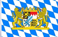 The blue and white sections are associated with the colors of Bavaria. Bavaria's traditional colors appear prominently in its familiar blue-and-white lozenge pattern.
There was, however, an important complication when BMW created its trademark. German trademark rules at the time restricted the commercial use of state coats of arms and other symbols of sovereignty.
BMW therefore did not simply reproduce the Bavarian state symbol. The colors were arranged within BMW's own circular trademark, with the order of the colors differing from the conventional heraldic presentation.
The result created a clear visual connection to the company's Bavarian identity without simply reproducing Bavaria's official emblem.
Does the BMW Logo Represent an Airplane Propeller?
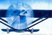 The popular explanation says that the four sections in the center of the BMW logo show a rotating airplane propeller: white or silver propeller blades moving against a blue sky.
It is easy to understand why the story became believable. BMW had strong connections to aircraft engines, and the quartered design can visually resemble a spinning propeller.
However, the original BMW logo was not created as a depiction of a propeller. The blue and white were already part of the company's emblem before BMW began promoting the propeller interpretation.
How the BMW Propeller Story Became Famous
The propeller explanation did not simply appear out of nowhere. BMW itself helped establish the association.
In 1929, years after the BMW trademark had been created, an advertisement showed the BMW emblem positioned inside a rotating aircraft propeller. The imagery connected the company with its aircraft-engine heritage and made the propeller interpretation particularly convincing.
BMW later used similar imagery again, strengthening the association between the roundel and aviation. Over time, the advertising interpretation became so widely repeated that many people came to believe it explained the original design.
This is why both Bavaria and the airplane propeller appear repeatedly in discussions about the BMW emblem. Bavaria explains the origins of the blue-and-white design, while BMW's aviation history and later advertising explain why the propeller story became famous.
How Has the BMW Logo Changed?
The BMW emblem has been updated several times, but its fundamental design has remained remarkably consistent. The company has retained the circular shape, BMW lettering, black outer area, and blue-and-white center throughout most of its history.
Changes have generally involved typography, proportions, borders, shading, and presentation rather than replacing the basic identity of the emblem.
That consistency has helped make the BMW roundel one of the automotive industry's most recognizable symbols. Although BMW vehicles, technology, car keys, and security systems have changed dramatically over the decades, the essential appearance of the emblem remains connected to the company's earliest years.
BMW Logo FAQ
What does BMW stand for?
BMW stands for Bayerische Motoren Werke, commonly translated into English as Bavarian Motor Works.
What do the blue and white colors in the BMW logo mean?
The blue and white are associated with Bavaria, the German state where BMW originated.
Is the BMW logo an airplane propeller?
Not originally. The logo was not designed as a propeller. The famous interpretation developed later and was reinforced by BMW advertising that depicted the emblem within a rotating aircraft propeller.
Why do so many people believe the BMW logo is a propeller?
BMW began as an aircraft-engine manufacturer, and later advertising deliberately connected the emblem with a spinning propeller. That imagery helped turn the interpretation into a widely repeated story.
When was the BMW logo created?
The first BMW trademark containing the recognizable circular BMW emblem was registered in 1917.
Has the BMW logo always looked the same?
No. Details such as the lettering, borders, proportions, and visual styling have changed over time. However, the basic circular design with BMW lettering and a blue-and-white center has remained remarkably consistent.
